Welcome back to the Extra Edition newsletter! I hope everyone had a very blessed Easter. I’m excited to bring you bonus content each month with a special inside look at my novels and the history behind them.
Behind the Design of Across Oceans
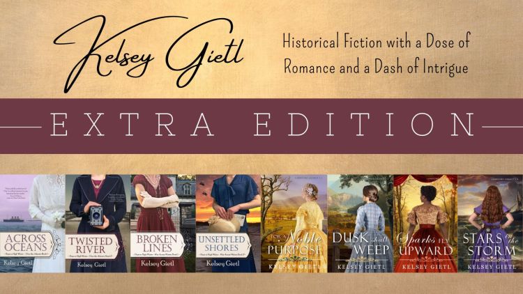
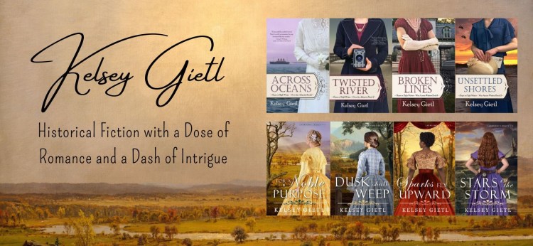
I recently reread my first published novel, Across Oceans, and realized how far I’ve come as an author and cover designer. Since that first design, between my own books and other authors, I’ve created hundreds of different versions of covers, most of which are never shown to the readers. (You can see the ones that made the cut here.) So, today, I thought it would be fun to share the design process for Across Oceans including all three “final” versions.
Version #1 – “The Suitcase”
Across Oceans takes place in the early 1910s, the exact same time that my great-grandmother was married and luckily for me, I still have her wedding dress. Since the story involves travel, I also wanted to incorporate my grandmother’s antique suitcase. Here are some of the photos from the first photo shoot:

Here is how the first cover turned out – my great-grandmother’s wedding dress, gloves, and headpiece inside my grandmother’s suitcase. I was in love with this design. It had exactly the romantic feel and nostalgia I was going for. I even printed a proof copy and still thought it was great.
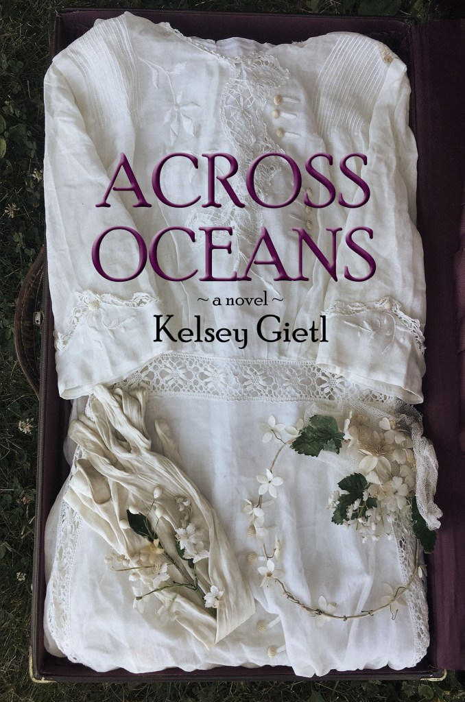
Then I showed it to my beta readers, and their comments shattered all those warm fuzzy feelings I had. “It’s a great first try.” “It’s boring.” “It looks like an indie cover, you need something more professional.” “The font is, um, ok, I guess.” “The font is definitely wrong.” “Where’s the ocean?” I’ll admit, I was initially overwhelmed, but I picked myself up, reviewed a LOT of historical fiction covers, opened a blank file, and started again.
Version #2 – “Make It Blue”
Photo shoot #2 took a different approach. I realized that readers, especially romance readers, tend to prefer people on the cover. But this was my first book, stock photos were expensive (and still are), and I didn’t yet understand all the nuances of copyrights and acceptable stock sites. Therefore, across my first four books, I only used photos that belonged to me. For Across Oceans, I was the model in my great-grandmother’s wedding dress and my daughter took the photos. Here are a few of the many photos we took:
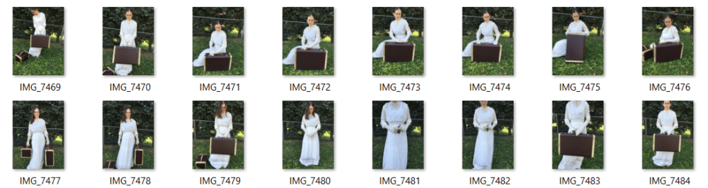
Despite my love of the suitcase, it didn’t fit the cover and was eventually nixed. I blended the colors on the dress, added an ocean photo I had taken in Florida for the background, drew a ship in Photoshop, added a tagline, and found a better font. I was once again in love with the cover, especially after I received the green light from beta readers. I approved my proof and uploaded it for publication.
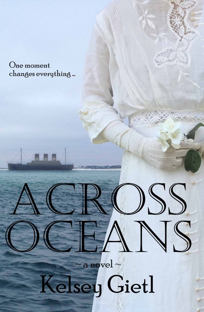
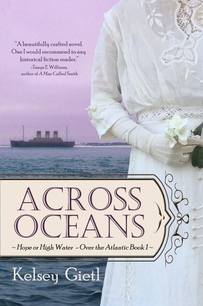
Version #3 – “Make it Pink”
But over the next six months, I kept looking at that cover and started feeling that something was off about it. I just couldn’t figure out what. Then one of my beta readers said to me, “Maybe because it’s so blue?” It was like a light went off. She was right! All the colors blended together. It didn’t stand out when compared to other book covers. I did some more research and learned that adding a pop of color (especially a shade of red) is more likely to draw a reader’s eye. So, I changed the sky to a pinkish purple, added a background and border to the title, and swapped out the tagline for an author endorsement to better fill the space. Across Oceans also received a new series title: Over the Atlantic.
Voila! Here is the cover that has been used ever since:
Until next time, happy reading!
Ad Majorem Dei Gloriam
Kelsey
Purchase signed copies of my books: kelseygietl.com
Follow me on:


COPYRIGHT © KELSEY GIETL 2025
Purple Mask Publishing
2025 Zumbehl Rd, Ste. 33
St. Charles, MO 63303
